⭐ 5.00
👁️ 3321221
👎 0
❤️ 0
💬 1755
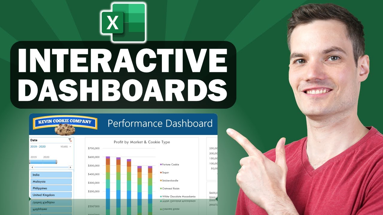
How to Build Excel Interactive Dashboards
In this step-by-step tutorial, learn how to create dynamic and interactive Excel dashboards. With a dashboard, you can showcase the most important information and key performance indicators (KPIs) that your organization cares about. All you need is Microsoft Excel — there’s no need for any VBA or add-ons. When you receive new data, you can easily update your dashboard to reflect the latest. You can adjust the look and feel using various themes and you can even customize the dashboard to match your organization’s color scheme. Once you finish, you can share out your dashboard easily for others to consume. If you’d like to follow along, you’ll find the sample sheet that I used below.
RESOURCES
– Sample spreadsheet to follow along: < target="_blank">AmxrofZZlZ-whMgx8bXq-2uARjf45Q?e=VU4CPy
– Introduction to Pivot Tables video:
– Advanced Pivot Tables video:
⌚ TIMESTAMPS
00:00 Introduction
00:52 Background on dashboard
01:25 Overview of data
02:15 Create table
02:55 Insert pivot tables
04:10 Pivot table 1
08:43 Pivot table 2
10:00 Pivot table 3
11:57 Align objects
12:31 Set chart height and width
12:50 Add timeline & slicers
14:42 Connect slicers to all pivot charts
15:47 Using slicers to filter
16:02 Add new data & refresh dashboard
17:13 Adjust view to look less like Excel
17:58 Customize theme
18:28 Share dashboard
18:54 Wrap up
RELATED VIDEOS
– Playlist with all my videos on Excel:
NEWSLETTER
– Get the latest high-quality tutorial and tips and tricks videos emailed to your inbox each week: < target="_blank">
CONNECT WITH ME
– Official website: < target="_blank">
– LinkedIn:
– Discord: < target="_blank">
– Twitter:
– Facebook:
– TikTok: kevinstratvert
– Instagram:
TOOLS AND DISCOUNTS
️ Voicemod AI Voice Changer | 5% off | < target="_blank">
Squarespace Websites | < target="_blank">
Grammarly | < target="_blank">
️ Shopify | < target="_blank">
Notion | < target="_blank">
️ Figma | < target="_blank">
🤖 ElevenLabs Text-to-Speech | < target="_blank">
MY COURSES
– Go from Excel novice to data analysis ninja in just 2 hours: < target="_blank">
REQUEST VIDEOS
< target="_blank">
SUBSCRIBE ON YOUTUBE
SUPPORT THE CHANNEL
– Hit the THANKS button in any video!
– Amazon affiliate link: < target="_blank">
DISCLOSURE
Some links are affiliate links. Purchasing through these links gives me a small commission to support videos on this channel. The price to you is the same.
#stratvert
In this step-by-step tutorial, learn how to create dynamic and interactive Excel dashboards. With a dashboard, you can showcase the most important information and key performance indicators (KPIs) that your organization cares about. All you need is Microsoft Excel — there’s no need for any VBA or add-ons. When you receive new data, you can easily update your dashboard to reflect the latest. You can adjust the look and feel using various themes and you can even customize the dashboard to match your organization’s color scheme. Once you finish, you can share out your dashboard easily for others to consume. If you’d like to follow along, you’ll find the sample sheet that I used below.
RESOURCES
– Introduction to Pivot Tables video:
– Advanced Pivot Tables video:
⌚ TIMESTAMPS
00:00 Introduction
00:52 Background on dashboard
01:25 Overview of data
02:15 Create table
02:55 Insert pivot tables
04:10 Pivot table 1
08:43 Pivot table 2
10:00 Pivot table 3
11:57 Align objects
12:31 Set chart height and width
12:50 Add timeline & slicers
14:42 Connect slicers to all pivot charts
15:47 Using slicers to filter
16:02 Add new data & refresh dashboard
17:13 Adjust view to look less like Excel
17:58 Customize theme
18:28 Share dashboard
18:54 Wrap up
RELATED VIDEOS
– Playlist with all my videos on Excel:
NEWSLETTER
CONNECT WITH ME
– LinkedIn:
– Twitter:
– Facebook:
– TikTok:
– Instagram:
TOOLS AND DISCOUNTS
MY COURSES
SUBSCRIBE ON YOUTUBE
SUPPORT THE CHANNEL
– Hit the THANKS button in any video!
DISCLOSURE
Some links are affiliate links. Purchasing through these links gives me a small commission to support videos on this channel. The price to you is the same.
#stratvert
Rating: 5.00
Views: 3321221
Dislikes: 0
Favorites: 0
Comments: 1755
kevin stratvert,excel,dashboard,interactive,interactive dashboard,dashboards,excel interactive dashboard,interactive dashboard excel,microsoft,ms excel,excel dashboard,dynamic,pivot table,pivot chart,how to,tutorial,dynamic dashboard,kpis,kpi,pivot,data,table,tables,timeline,slicers,slicer,timelines,filter,refresh,basics,easy,simple,learn,training,dash board,console,design,report,excel dashboard for beginners,template,templates,pivottable,worksheet,spreadsheet,labels,ms
kevin stratvert,excel,dashboard,interactive,interactive dashboard,dashboards,excel interactive dashboard,interactive dashboard excel,microsoft,ms excel,excel dashboard,dynamic,pivot table,pivot chart,how to,tutorial,dynamic dashboard,kpis,kpi,pivot,data,table,tables,timeline,slicers,slicer,timelines,filter,refresh,basics,easy,simple,learn,training,dash board,console,design,report,excel dashboard for beginners,template,templates,pivottable,worksheet,spreadsheet,labels,ms
🛒 20% to 80% Discount Just for You!
Shop it now on Amazon and grab exclusive deals 👇
🛒 a href="🛒 Smart Gadget
🛒 a href="
🛒 Smart Gadget
🛒 a href="
🛒 Smart Gadget
🛒 a href="
🛒 Smart Gadget
🛒 a href="
🛒 Smart Gadget
🛒 a href="
🛒 Smart Gadget
🛒 a href="
🛒 Smart Gadget
🛒 a href="
🛒 Smart Gadget
🛒 a href="
🛒 Smart Gadget
🛒 a href="
🛒 Smart Gadget
🛒 a href="
🛒 Smart Gadget
🛒 a href="
🛒 Smart Gadget
🛒 a href="
🛒 Smart Gadget
🛒 a href="
🛒 Smart Gadget
🛒 – Sample spreadsheet to follow along
🛒 – Get the latest high-quality tutorial and tips and tricks videos emailed to your inbox each week
🛒 – Official website
🛒 – Discord
🛒 ️ Voicemod AI Voice Changer | 5% off |
🛒 Squarespace Websites |
🛒 Grammarly |
🛒 ️ Shopify |
🛒 Notion |
🛒 ️ Figma |
🛒 🤖 ElevenLabs Text-to-Speech |
🛒 – Go from Excel novice to data analysis ninja in just 2 hours
🛒 REQUEST VIDEOS
🛒 – Amazon affiliate link
WOW Onion Black Seed Hair Oil - Controls Hair Fall - No Mineral Oil & Silicones - 200mL
₹329.00 (as of September 23, 2025 23:51 GMT +00:00 - More infoProduct prices and availability are accurate as of the date/time indicated and are subject to change. Any price and availability information displayed on [relevant Amazon Site(s), as applicable] at the time of purchase will apply to the purchase of this product.)
KINGSWAY Accessories Car Side Window Sun Shade Zipper Magnetic Only Compatible with Hyundai Creta Year 2024 Onwards All Model, Only Zipper in Front Window, Car Curtains, Pack of 4 Pcs
₹1,098.00 (as of September 23, 2025 23:45 GMT +00:00 - More infoProduct prices and availability are accurate as of the date/time indicated and are subject to change. Any price and availability information displayed on [relevant Amazon Site(s), as applicable] at the time of purchase will apply to the purchase of this product.)
Max Care Virgin Coconut Oil (Cold Pressed) 500Ml
₹425.00 (as of September 23, 2025 23:52 GMT +00:00 - More infoProduct prices and availability are accurate as of the date/time indicated and are subject to change. Any price and availability information displayed on [relevant Amazon Site(s), as applicable] at the time of purchase will apply to the purchase of this product.)
Lakme Enrich Matte Lipstick, Shade RM16, 4.7g
(as of September 23, 2025 23:51 GMT +00:00 - More infoProduct prices and availability are accurate as of the date/time indicated and are subject to change. Any price and availability information displayed on [relevant Amazon Site(s), as applicable] at the time of purchase will apply to the purchase of this product.)